
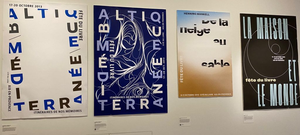
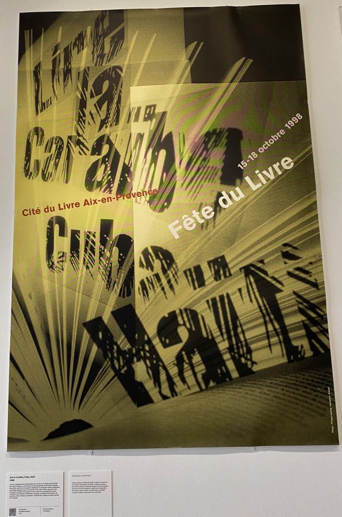
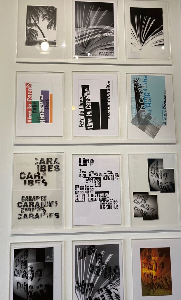
Key visuals have the potential to appeal to us like an own language. From a communication point of view the message is simple. You send a message from your visual appearance even if you do not intend to do so. Hence, better think about it briefly before you go public. The receiver might interpret your visual statement differently from you or other peers, but you offer a coherent version of your activity or appearance. Be it politicians (Merkel) or others, frequently memory allows only for key visuals to make lasting impressions or for something or someone to enter into collective memory of a decade or even a century. Repetition, also from different sources, plays a major part in this. It is surprisingly still uncommon to hire persons in charge of key visuals for a person, an organisation or a festival. Haphazard treatment of key visuals as part of marketing is probably an underestimation of the lasting impact of a coherent visual message. Stability and repetition are key here, rather than the wide-spread ad-hoc approaches to marketing. Only on the margin of the exposition devoted to Philippe Apeloig “Des esquisses à l’affiche” (BnF) this lesson can be learned. The merit of the exposition is the opening-up of the process of creation. Posters, graphics and typescripts all contribute to the overall visual message. Achieving coherence in the thousands of choices demands an aesthetic point of view. This may blend aesthetic languages of a decade and reflections on the subject. Catching an audience at the time of affluence of images, movies and accelerated rhythms of daily life remains a challenge. For the “Fête du Livre” Apeloig has achieved this in a memorable way, well worth a tiny exposition of donations from a master in visual communication. 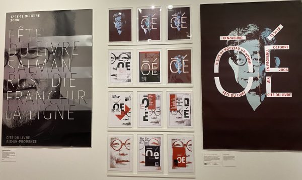
2 Replies to “Visual”
Comments are closed.